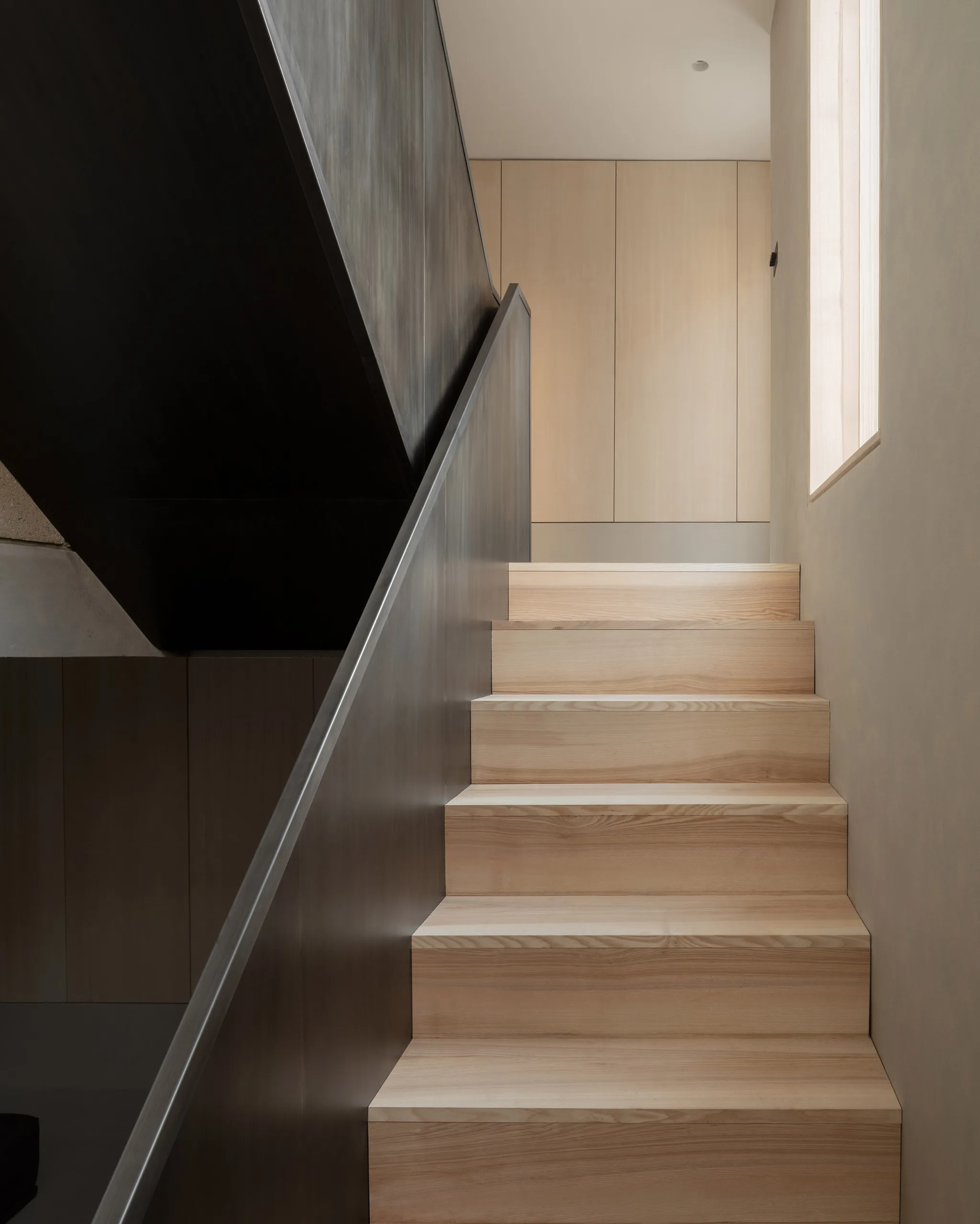
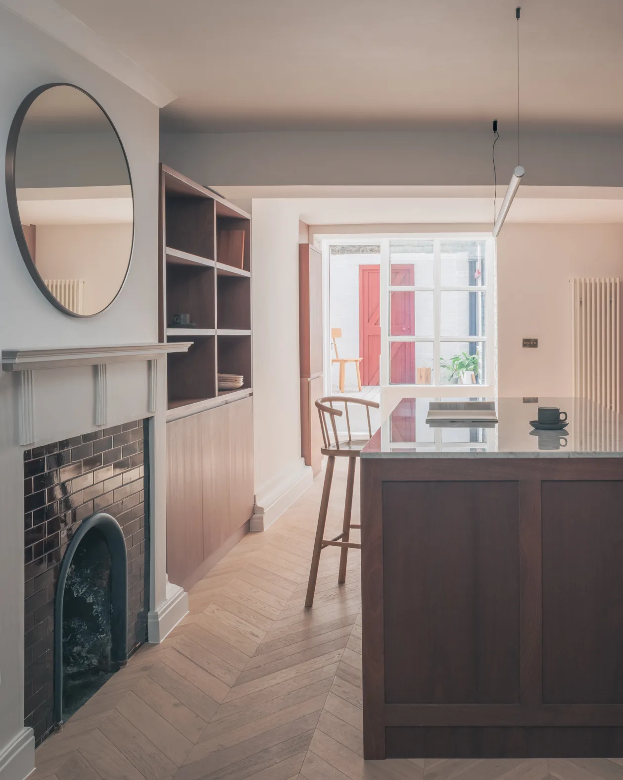
 Caption
Journal typography and media — sample entry
Written by Jack Pannell
This is regular body text. Journal articles use this style for their main reading copy, with comfortable line spacing and a consistent column width.
A second paragraph shows the spacing between ideas. This is bold, using our medium font weight. This is italic for emphasis. You can combine medium and italic too.
Heading 2 — a new section
Use this heading to introduce a main section of the article. This is an example text link to the Brief page.
Heading 3 — a smaller subheading
Use this for a topic within a section. Font sizes and colours are set by the theme.
- Bulleted list: the first point.
- A second point with medium emphasis.
- A third point that can wrap naturally onto another line.
- Numbered list: start with a conversation.
- Explore the possibilities.
- Develop a shared understanding.
This is a quotation. It has a simple line at the side and uses the italic font.
Use a separate Media row for images or videos. This keeps their width, captions and loading consistent.
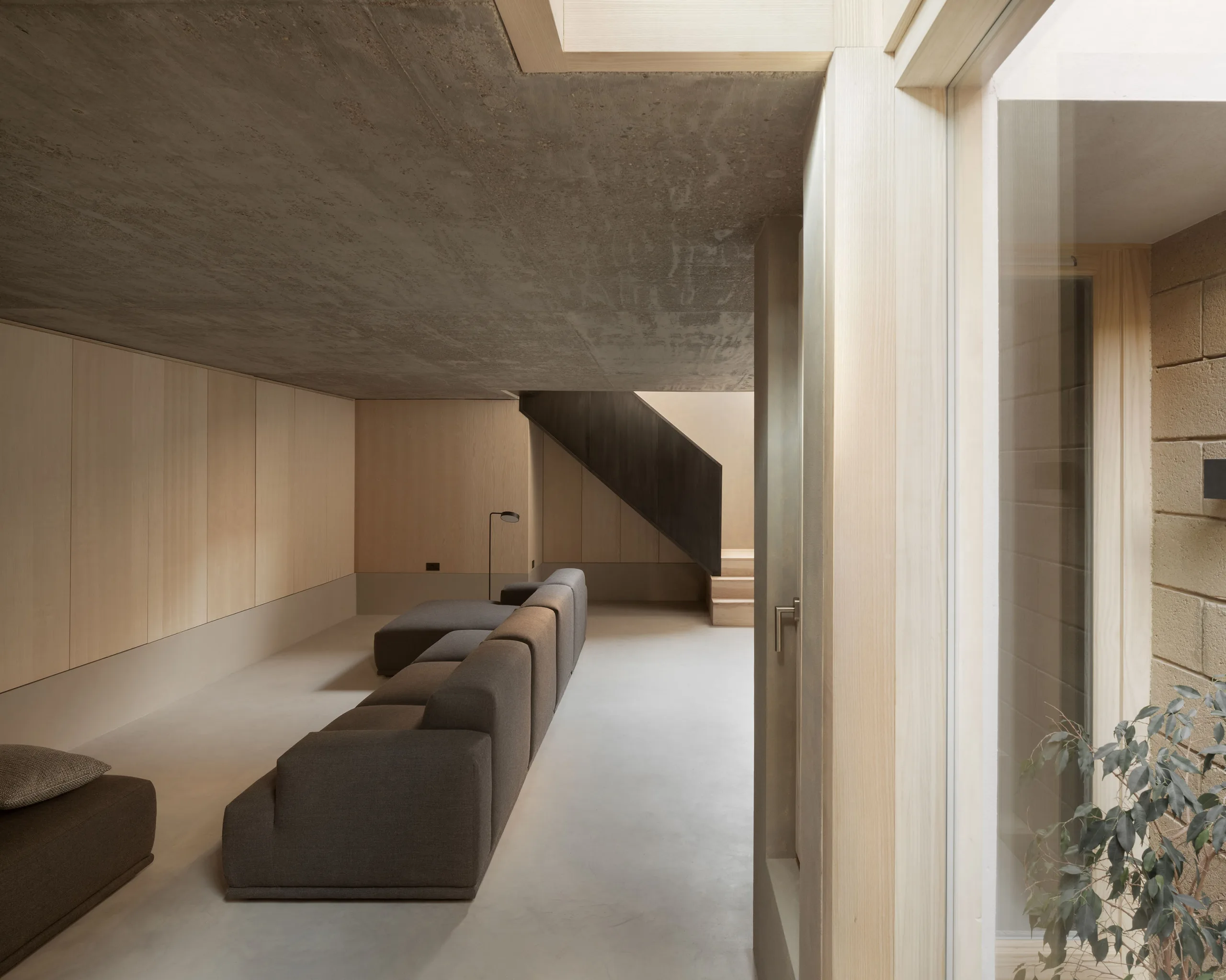 Caption test
Reading-width media
The next row contains an image at the same width as the text. This works well for supporting photographs, drawings and diagrams.
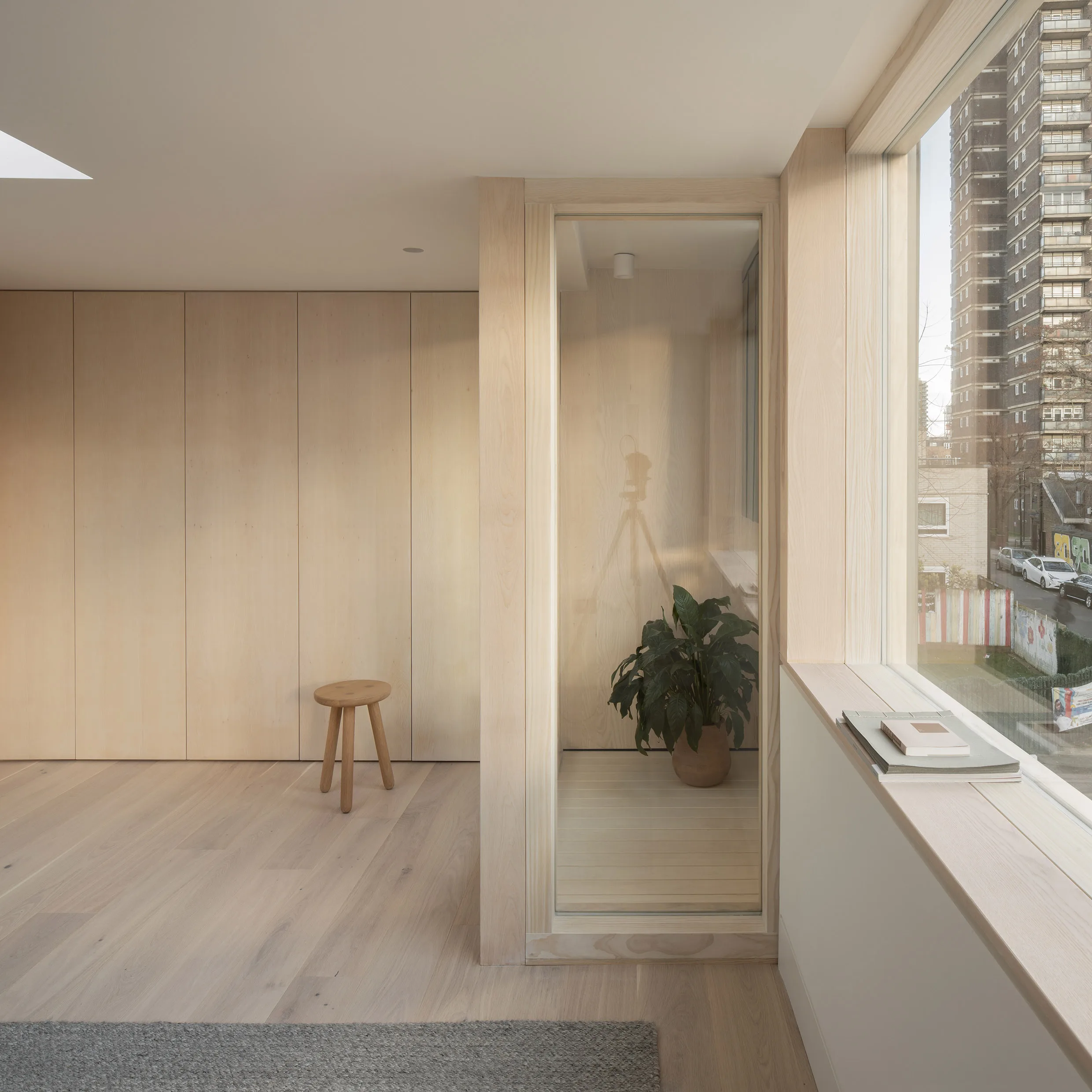
Video example
Media rows can also show a muted looping video, with an optional poster. The example below uses a video already in the library.
This final paragraph closes the article before the next entry and shared call to action.
Caption